How to present interior design selections to clients
A practical guide to presenting product selections so clients understand the room, compare alternatives and approve items in context instead of over email and WhatsApp.

Table of contents
Share
We'll start with a familiar story. Two weeks ago you presented the concept to the client with much success. Large images on a screen, a palette, two reference rooms and a mood board. The client loved it and couldn't wait for the selections.
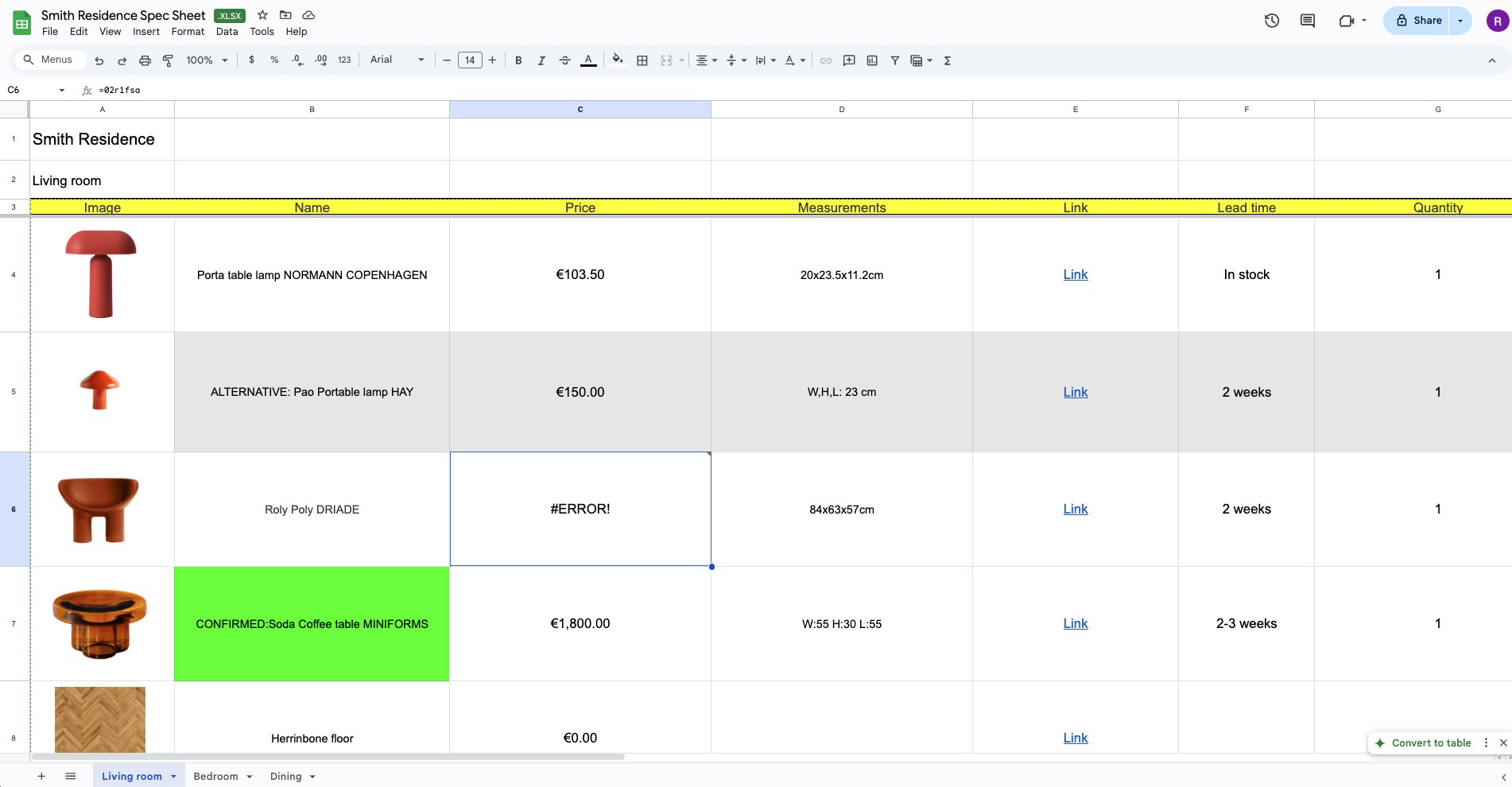
Tonight they are on the sofa with a phone, opening the link to the products and what they get... is a spreadsheet. The dining chair is near the top at about the size of a postage stamp, so they tap through to see the fabric properly and land on a supplier site with a cookie banner across it. Getting back is two clicks of the browser button. How much is it? They have to scroll somewhere to the right - but is it the correct row?
Above the link is your message. It explains which products you have updated since Thursday, that the pendant now has an alternative in the row underneath it and that the sofa needs an answer before the joiner starts. They read the message, go back to the spreadsheet and promptly lose their place. To make things more interesting they also have to keep the floor plan open in a third tab, because item 4.12 means nothing until someone finds 4.12 on the plan.
Now comes the essential question - how or where do they leave the comments? How do they approve or ask for a different color? Reply inside the spreadsheet where the comment might never be seen? Reply to the message and hope you can work out which of the four chairs they mean? Or leave it until the weekend when there is a laptop and more patience.
What this stage needs is one single place where the client can look at the products and decide on them, with the conversation happening on the products themselves. That means images at a size where they can see the finish. It means grouping that follows how the client thinks about their own home rather than how you built the file, with the alternative placed next to the thing it is an alternative to. Items waiting on an answer should look different from items sent for information. A comment about the pendant should still be attached to the pendant a month later.
What a shared link did and did not fix
Most studios have tried solving this once already. What used to be a PDF or an Excel attachment became a share link to Google Sheets or a Dropbox folder containing everything related to the project, including the latest PDF. This was great, because everyone knew which version was the latest and where to access it.
So what did that change? Well, the delivery got better and some of the confusion was removed. However, what didn't change was the fact that the clients are still faced with the file you built for yourself. Dense on purpose, carrying supplier codes and quantities and lead times because you need all of it in one place. The client is reading your working document and doing their best with it.
The message is doing the presenting
Read the WhatsApp or the email again and notice how much of the actual presentation is in it. What moved since Thursday. Which pendant is the alternative and which is your recommendation. What has to be decided before the joinery goes into production. Where to send the answer.
All of that is being delivered as prose, in a channel that contains no products, alongside a document that shows none of the reasoning. The client juggles two things on a phone and matches one against the other.
And then there's the decisions. The dining chairs were approved in an email reply. The pendant was refused in a voice note with the reason sent separately by the client's partner, who was never on the email.
A month on, somebody asks why the pendant changed. Who knows?!
Selections ask more of a client than a concept does
A mood board wants a reaction. A client can give you one straight away because they know whether they like it.
Product selections need something harder. Your client has to look at one chair, at one price, for one room and say yes to it while knowing the yes becomes an order with a lead time attached. Before they can do that they have to reassemble the room out of a spreadsheet table. Which four of these belong in the living room. Is this the lamp from the render. Is this the fabric from the March conversation. And so on.
The alternatives are usually where it stops
You will have offered a couple of options on the pieces that make or break a room. As rows, those options simply look like more items. The client cannot see whether you are asking them to pick one or to sign off on all of them. The safest response to an unclear question is no response, so a week later there is an apology about being slow.
Plan position does the same thing. You know 4.12 is the reading lamp by the door. The client is matching numbers by hand, in another tab, hoping they have the right one.
The process is part of what they are paying for
Interior design gets bought by choice. Nothing forces a client to hire a designer the way a building project forces them to involve an architect, so all the way through the job they are forming a private view about whether the fee was worth it. Some of that verdict comes from the room. Some of it comes from how your work arrives.
Lukas Senkus of Senkus Design says it directly:
"We provide an expensive service. So when clients get the information, they should feel that it is next level."
Fair or not, clients rarely compare interior design studios to other studios - they just don't have the experience. What they compare you against is other experiences they've had and they've come accustomed to. That link you sent opens on the same phone they browse Pinterest on or do most of their shopping these days. But the experience couldn't be any more different and unfortunately not in a good way.
The standard worth holding a tool to
Before choosing software, decide what a client ought to be able to manage on their own:
tell an item that needs a decision from an item sent as information;
see a product at a size where the material is legible;
put the alternative beside the main choice without going looking for it;
check where a piece goes, with the plan and the mood board to hand;
comment on one specific item without first describing which one they mean;
approve or reject something and have their name recorded against it;
reopen the same current version later without wondering if it moved;
do all of it on a phone without pinching.
Nearly every line there is communication. A presentation that cannot hold the conversation hands it to WhatsApp instead. The decisions travel along with it.
How thesheet keeps the products and the decisions in one place
In thesheet the specification you work in and the presentation your client reads are one project. You build it once and the client opens a client view in their browser with nothing to download and no login screen to get past.
Selections appear visually, in the grouping you gave the project, with each product's detail available on the product. Floor plans and mood boards are right there in the same client-facing project, so checking where a piece goes does not mean opening a separate file. The client view shows the current project rather than an export of it, so the change you made this morning is the version they read tonight and there is no client copy of the specification to maintain alongside your own.
Comments, approvals and rejections attach to the item they concern. The chair has its own history, so updating the project later means reading the project rather than transcribing a chat.

Sending has not changed much. You can email the link from thesheet or paste it into WhatsApp yourself if that is how this client talks to you. What changes is that the message is just the link, not the entire project.
One link per person
Thesheet's personal links belong to a single email address. The person who opens it is recognised without a login or a name prompt. Their actual name is on everything they comment on, approve or reject. When a client, their partner and a contractor are all working through the same selections, you can see who said what and when.
Each personal link has its own settings for Brand, Supplier, Price and Technical details. You also decide, per person, whether they can approve and reject or only look and comment. Public links are still there for the cases where an anonymous one is enough.
Studio branding carries your logo, your colours and your font into the client link, so what the client opens looks like it came from your studio.
A check before it goes out
Open the client view and read it on your phone, in the order the client will meet it.
Put this week's decisions at the front. When every item looks equally urgent, none of them get answered.
Mark the alternatives as alternatives and say which one you would go with.
Make each item decidable: what it is, which room, what the client pays, when it lands.
Check the visibility settings for this specific person before you send their link.
Say where to comment and by when you need the answers.
The work is mostly deciding what you actually want answered.
Read one project the way your client reads it
Take a project that is live right now. Open its client view, read it through on your phone as the client would, then send it. thesheet is free to try.