How to Present Interior Design Selections on a Floor Plan
Show clients where furniture, finishes and fixtures belong, while keeping product details, comments and approvals connected to the live project.

Table of contents
Share
You have chosen the products, sorted them by room and built a schedule you can read at a glance. Then the client opens it, scrolls through a grid of rows and reference codes and asks where the pendant actually goes.
That gap is the real problem with presenting selections. A schedule is built for the person who made it. The client is looking at the same rooms you are, but they cannot see them in your list. So most designers rebuild the work into a PDF, a presentation board or an annotated plan, then chase decisions across email and a WhatsApp thread. Now there are two versions of the project to keep in step. The moment a client approves something the answer lands somewhere other than the schedule it belongs to.
A useful client presentation does something different. It shows where each selection sits in the space, gives the client enough to decide without exposing every internal field then keeps the decision attached to the live product record instead of a detached file. The rest of this post is about how to get there and how a floor plan can actually do the heavy lifting.
Why is a complete product schedule still hard for a client to read?
A finished schedule and a clear presentation do two different jobs. The schedule proves your work is organised. It leaves the client to work out for themselves which sofa you mean or how the lighting reads against the joinery. That translation is still yours to make.
The designer sees a system, the client sees rows
You built the schedule, so you carry the plan in your head. Row 14 is the reading-corner floor lamp. The alternative in the next column is the fallback if the finish is discontinued. The code ties back to the supplier. A client has none of that context. Take one room with lighting, upholstery, a couple of finishes and an alternative or two, spread across a schedule and a separate plan, then a client is holding two documents that never quite line up.
Rebuilding the schedule as a presentation creates a second version
The usual fix is to rebuild. You lift the selections into slides or a board, drop them onto an image of the plan then send it over with a note asking for sign-off. It looks better, so for a while it holds. The trouble starts the moment something changes. A client approves two of the three lighting options, a finish gets swapped, a price moves. Now the presentation and the schedule disagree. The approval you were waiting for is sitting in an email rather than against the product it relates to. The work of presenting has quietly become the work of reconciling two records.
What does a useful interior design client presentation need to show?
A good presentation goes past making the schedule prettier. It gives the client the three things they need to decide, while leaving out the things that get in the way. These hold whether you use a dedicated tool or work by hand.
Where each selection belongs
Put the choice in the room. A client understands a floor plan, an elevation or a render far more readily than a spreadsheet, because it matches the space they already picture. When the pendant sits over the island and the console sits against the hallway wall, the question stops being "which item is this" and becomes "do I like it here".
Enough detail to make the decision, without every field
Show the image, the product information that matters and any alternatives you want to offer, along with where the choice currently stands. Leave out the internal columns the client has no use for. Selective detail keeps the work intact while giving the client a clear runway to decide, instead of the feeling of being handed a database.
One place for the decision and its context
When the client comments or approves, that should land against the product itself, rather than in a reply three threads deep. The comment, the status and the current product record belong together, so that a month later you can see what was decided and why without reassembling it from your inbox.
A useful presentation, then, holds five things at once: spatial context, selective detail, a clear status, the right visibility for each person and one current record. If you are structuring an interior design spec sheet well already, you have the raw material. What follows is how to make it legible to a client without building it twice.
How can selections be presented on the plan without rebuilding the project?
You can keep the project as it is. This is where thesheet comes in. thesheet is project specification software for interior designers. It holds the products, images and details you have already added to a project. Its Plan View takes those same products and lets you place them on a floor plan, a room render or a PDF. The presentation becomes a view of the live project rather than a copy of it.
From product schedule to spatial review
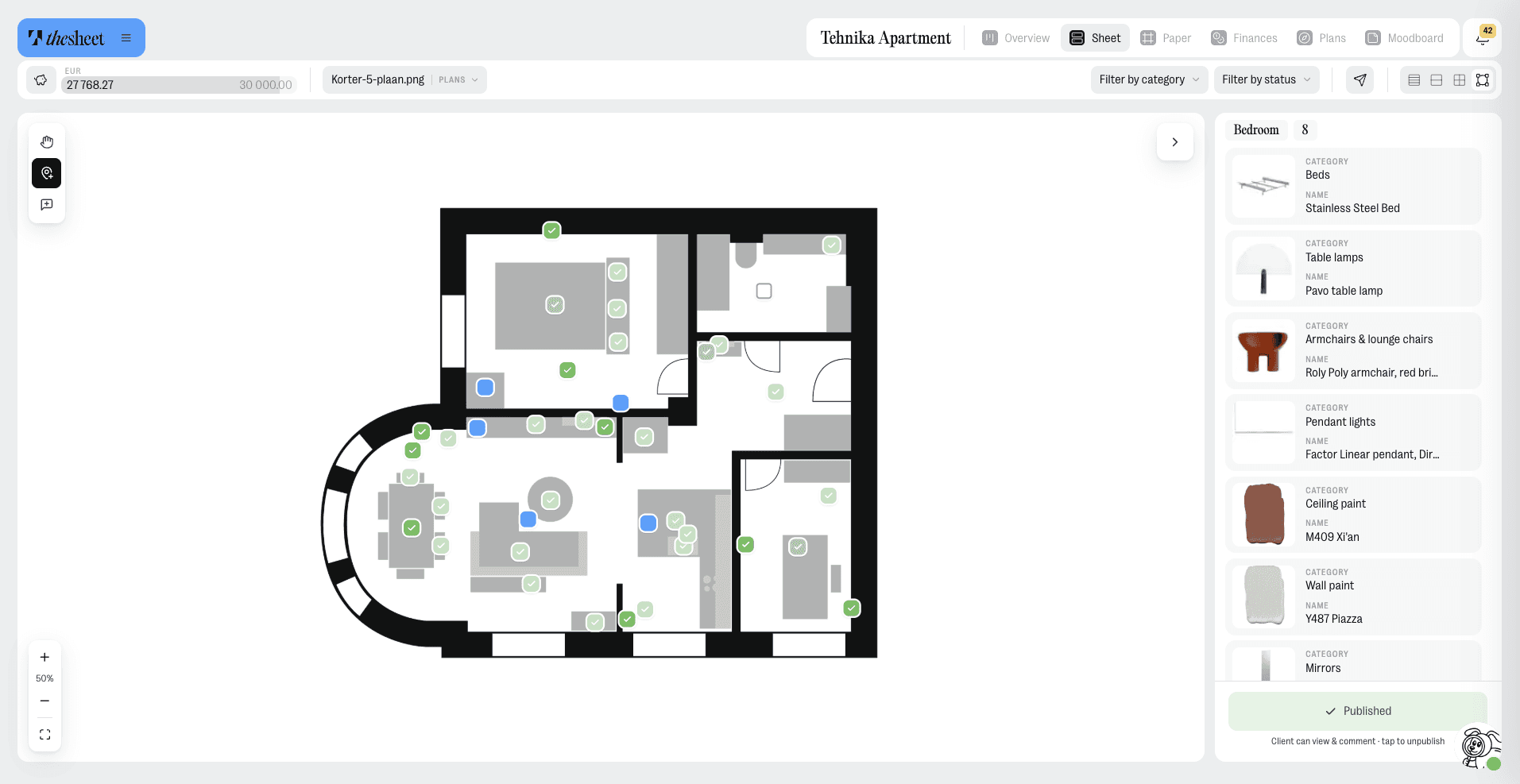
You add a plan, a render or a PDF as the background, then drop products from the project onto it as dots and drag them where they belong. Each dot carries its status by colour and shape, so Draft, Proposed, Approved and Rejected are all readable at a glance without opening anything. Where a note matters, a separate pin holds the text and an optional reference image, kept distinct from the product dots. You can add more than one plan or background and switch between them, so a whole apartment can spread across several images rather than being squeezed onto one. A plan stays a private draft until you publish it.
What the client can understand and decide
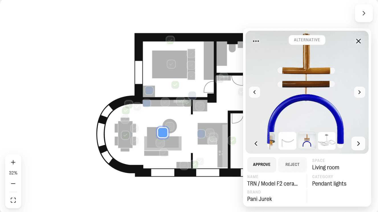
When you share it, the client opens a read-only version of the same plan. They can zoom in, work through the products grouped by space then approve or reject each one from its product card, where the image, the relevant details and any alternatives sit together. The decision they make updates the status you see, on the same project, against the same product. Nothing needs to be copied back by hand, because the presentation they reviewed and the record you work from are one and the same file.
How do you show the same project differently to each participant?
A client, a contractor and a colleague in your own studio are looking at the same project, but each of them needs a different cut of the information in it. The aim is to show one project three ways rather than build three separate projects.
The client sees what you choose to share
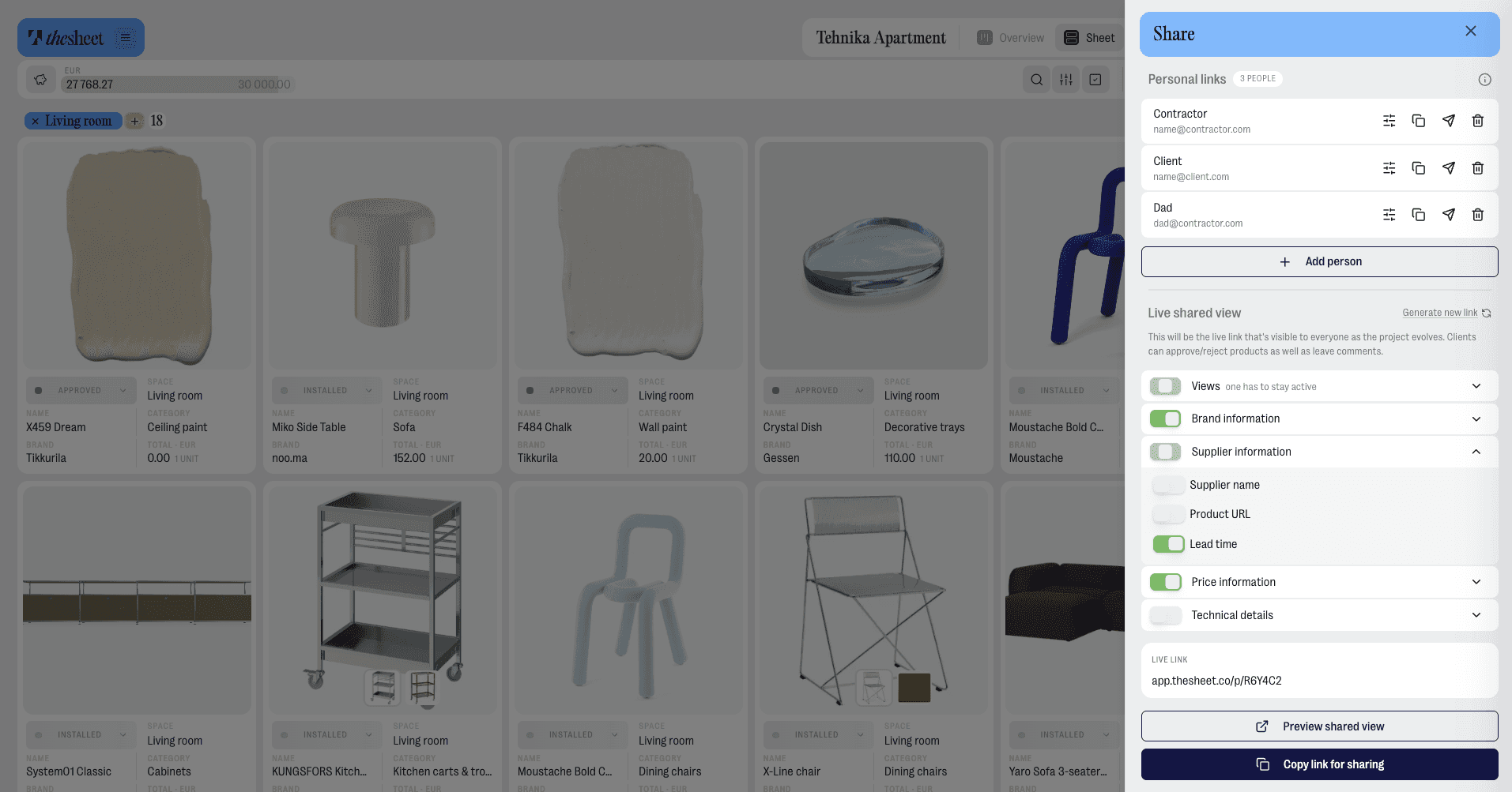
You decide which views of the project a client receives, so the presentation stays focused on what they are there to decide rather than every internal detail behind it.
Named recipients, with decisions that stay attached to a name
Personal Links let you give specific people their own link to the project, each with its own visibility settings, so a comment or an approval comes back attached to the name that made it. When two people are reviewing, you can see at a glance who approved the dining chairs.
Private studio context, kept separate from the client
Internal Notes are for the reasoning your team should see and keep away from the client, held right beside the product they relate to, while Messages are the client-visible thread. So the "let's push the supplier on lead time" note lives against the product for your team. The client only ever sees what is meant for them. When any of it moves, notifications point you back to the relevant note, message, mention or personal-link activity in the context of the project it came from, so you land straight on it.
What should stay connected after the presentation is sent?
The real test of a presentation comes a week after you send it, when decisions start coming back in. What matters then is how much of it still holds together.
Keep the spatial context, the product details, the comments and the decision status attached to one current project, so the follow-up stops being a second job. The client sees where each choice belongs and signs off against it. The approval updates the record you already work from, while your studio's private reasoning stays where the team can find it. The plan stays current as the project moves. Each approval sits against the product it relates to. The next change you make happens once, in the place you already work.
That is the difference between a presentation and a live project a client can read. If you also want the approvals side of this to stay clear and trackable as the project moves, the same principle carries: keep the decision next to the thing being decided.
Start your first project in thesheet and put your real selections on the plan.